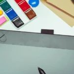
Typography is the silent ambassador of your event, shaping the first impression guests have of your celebration or gathering. The fonts you choose for your invitations—whether for a wedding, birthday, corporate event, or casual party—do more than convey information; they set the emotional tone, hint at the event’s style, and reflect its personality. From elegant serifs to playful scripts, typography can evoke sophistication, excitement, or warmth. In this article, we’ll explore how typography influences the mood of your invitations, share practical tips for choosing the right fonts, and highlight how you can create printable invitations using Adobe Express to bring your vision to life.
The Emotional Power of Typography
Every font has a personality that subtly communicates the essence of your event. Serif fonts, like Times New Roman or Baskerville, with their small decorative strokes, exude tradition and formality. They’re ideal for upscale occasions like weddings or charity galas, suggesting refinement and timelessness. For example, a serif font on a cream-colored cardstock invitation instantly signals a black-tie affair.
In contrast, sans-serif fonts like Helvetica or Lato are clean and modern, with no extra flourishes. Their simplicity conveys a contemporary, approachable vibe, perfect for tech launches, networking events, or minimalist parties. They’re highly legible, making them a go-to for invitations that prioritize clarity, especially for digital formats.
Script fonts, such as Pacifico or Dancing Script, mimic handwritten calligraphy, infusing invitations with a personal, intimate feel. They’re a natural fit for romantic events like engagement parties or anniversaries, evoking warmth and individuality. However, their ornate nature demands careful use to avoid readability issues.
Display or decorative fonts, like Bebas Neue or Bubblegum Sans, are bold and eye-catching, suited for themed events like music festivals or children’s birthdays. These fonts scream fun and creativity but can overwhelm if overused, so they work best as accents for headlines or key details.
By selecting fonts that align with your event’s mood—formal, casual, whimsical, or professional—you create an emotional connection with your guests before they even RSVP.
Aligning Typography with Event Themes
The key to impactful typography is matching fonts to your event’s theme and audience. A bohemian wedding might call for flowing script fonts paired with earthy tones, while a corporate conference demands crisp sans-serifs in neutral colors for a polished, professional look. Consider the cultural and demographic context of your guests: older audiences may prefer classic, readable serifs, while younger crowds might resonate with trendy, bold sans-serifs or playful display fonts.
For example, a vintage-themed anniversary party could use a serif font like Garamond for the main text, paired with a subtle script for names or dates to evoke nostalgia. A summer beach bash, on the other hand, might lean on a breezy handwritten font to reflect its laid-back vibe. The font’s weight, size, and color also matter—bold fonts draw attention to key details like the event title, while lighter weights work for secondary information like the venue or time.
Ensuring Readability and Visual Harmony
Typography isn’t just about aesthetics; it’s about communication. An invitation’s primary job is to deliver details clearly, and poor font choices can lead to confusion. Here are some tips to balance style and function:
- Font Size and Spacing: Use at least 10-12 point fonts for body text to ensure readability, especially for printed invitations. Line spacing (1.5x the font size) and even kerning (letter spacing) prevent text from feeling cramped or scattered.
- Contrast and Hierarchy: Create a visual hierarchy by varying font sizes and weights. For instance, use a bold 16-point font for the event name, a regular 12-point font for the date and time, and a smaller 10-point font for RSVP instructions. High contrast between text and background (e.g., black on white or gold on navy) enhances legibility.
- Limit Font Choices: Stick to 2-3 fonts to avoid visual clutter. A common approach is pairing a decorative header font with a simple body font, like a script for the couple’s names and a sans-serif for the event details.
Always test your design on different mediums—print a sample or view it on a phone screen—to ensure it’s legible across formats. Tools like Adobe Express, where you can create printable invitations, offer real-time previews to fine-tune your typography choices.
Mastering Font Pairing
Font pairing is an art that balances contrast and cohesion. A classic strategy is combining a serif and sans-serif font for variety—think Playfair Display (serif) for headings and Open Sans (sans-serif) for body text. This contrast creates visual interest while maintaining readability. Alternatively, use fonts from the same family, like Roboto Regular and Roboto Bold, for a cohesive look with subtle variation.
Avoid pairing fonts that are too similar, as they can clash (e.g., two serifs like Georgia and Times New Roman). Similarly, pairing two ornate scripts can feel chaotic. For themed events, a decorative font for accents paired with a neutral font for details strikes the right balance. Adobe Express’s template library suggests pre-paired font combinations, making it easy to achieve professional results.
Leveraging Digital Tools for Typography
Creating stunning invitations is easier than ever with digital design platforms. Adobe Express offers a vast library of fonts, from elegant serifs to quirky displays, along with customizable templates tailored to various events. You can experiment with font pairings, adjust sizes and colors, and preview your design in real-time. Once perfected, you can create printable invitations directly through the platform, choosing high-quality paper options for professional results or downloading digital versions for email or social sharing.
For instance, designing a baby shower invitation might involve selecting a playful script font for the baby’s name and a clean sans-serif for the event details, with pastel colors to match the theme. Adobe Express’s intuitive interface lets you swap fonts and tweak layouts until the tone feels just right.
Common Typography Mistakes to Avoid
Even with the best intentions, typography missteps can derail your invitation’s impact. Overusing decorative fonts can make text hard to read, while mixing too many fonts creates a disjointed look. Low-contrast color combos, like light gray on white, strain the eyes, and tiny font sizes frustrate guests. Always prioritize clarity over flair, and double-check that your fonts scale well for both print and digital formats.
Conclusion
Typography is the heartbeat of your invitation design, setting the tone and building anticipation for your event. By choosing fonts that reflect your theme, ensuring readability, and pairing them thoughtfully, you create invitations that captivate and inform. With tools like Adobe Express, where you can create printable invitations, the process is both accessible and fun. Experiment with fonts, test your designs, and let typography tell your event’s story. Whether it’s a grand wedding or a cozy gathering, the right fonts will make your invitations unforgettable.